How might we design legible signage for all users?
Tailor-made signage based on user needs and neighbourhood demographics.
- Understanding user profiles, patterns, and needs is crucial. You may find it helpful to use Design Thinking Tools “Focus Group” or “Problem Extraction & Priority Matrix” to discover and understand users’ needs.
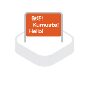
- Consider providing multilingual directions and utilising age-friendly design.
- Use sharp contrasting colours to help colour-blind users understand signs. When colour differentiation is required, red and green or blue and yellow should not be used together to avoid confusion.
- Employ different textures to create wayfinding cues for visually impaired users. For example, contrasting textures could signify intersections and zoning changes.
- Position signs at heights and locations that are convenient for all users。

Use legible, clear and easily understood icons and graphic representations.
Maintain consistency across all graphic elements. All designs should be consistent with the overall design themes of the POS and the characteristics of the surrounding areas.

Create a hierarchical signage system.
- Develop systematic and hierarchical rules to govern the quantities, locations, content, size, shapes, colours, and positions of signages.
- Consider the level of detail displayed in each sign and their respective locations. For example, signage on the main circulation path should provide directions to key attractions. Those in secondary paths branching off the main path should provide more detailed information on nearby amenities.
- Utilise sizes, shapes, colours, and positioning of signages to differentiate information and signal the level of importance.

- Ensure there is a suitable distance between each signage to avoid confusion.
